fbpx
discussion
Statistics and Probability: You’re Gonna Need Them

Statistics and Probability: You’re Gonna Need Them

During the Covid-19 pandemic we have probably all become more aware of the importance of understanding Statistics and Probability. The news is full of graphs, different statistics have been used to argue that we are doing well and not doing well. Understanding this topic can help in detecting whether we are being misled. 

“There are three kinds of lies: lies, damned lies, and statistics.”
Mark Twain

Types of data

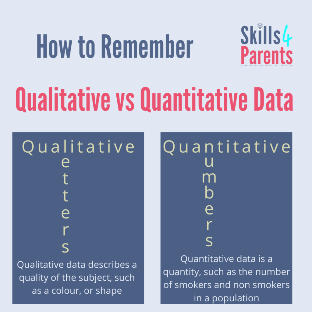
There are 2 main types of data Quantitative and Qualitative. Quantitative is data in numbers, and Quantitative is data in words (or letters). Quantitative can be split into discrete (separate, for example shoe sizes), and continuous (measurements).

Averages

This seems like a simple topic, ‘on average’ is a phrase that we use a lot, but do you ever consider which average? It actually makes quite a difference. A few years ago, I remember hearing statistics on the average wages of teachers, which included headteachers, so it sounded much higher than actually what most teachers are paid. 

To explain, the average pay in a factory, the mode (most common), is probably going to be very low, because of all the production workers who get a low wage. Dependent on the numbers in the factory and the number of middle managers, the median will also be quite low.

With a few executives who have VERY high salaries the mean will become higher, as it includes all the wages. 

See why this is important?

Graphs

We’ve seen a lot of graphs in the pandemic, and they are a great visual way to show information, fantastic for visual learners – if you don’t know about different learning styles yet, then hop over to this blog post on learning styles.

There are a few different types of graphs including, line graphs, bar charts, pie charts and histograms. Did you know that Florence Nightingale was a statistician and invented a type of pie chart? She worked in a time where information was given in tables, whereas she used a polar chart to powerfully demonstrate some of the issues to people who wouldn’t understand the data. She included visual representations to convey issues in a book that she published to the general public which has a strong impact. 

Graphs can also be used to mislead by changing the scales and making some things look bigger than they are.

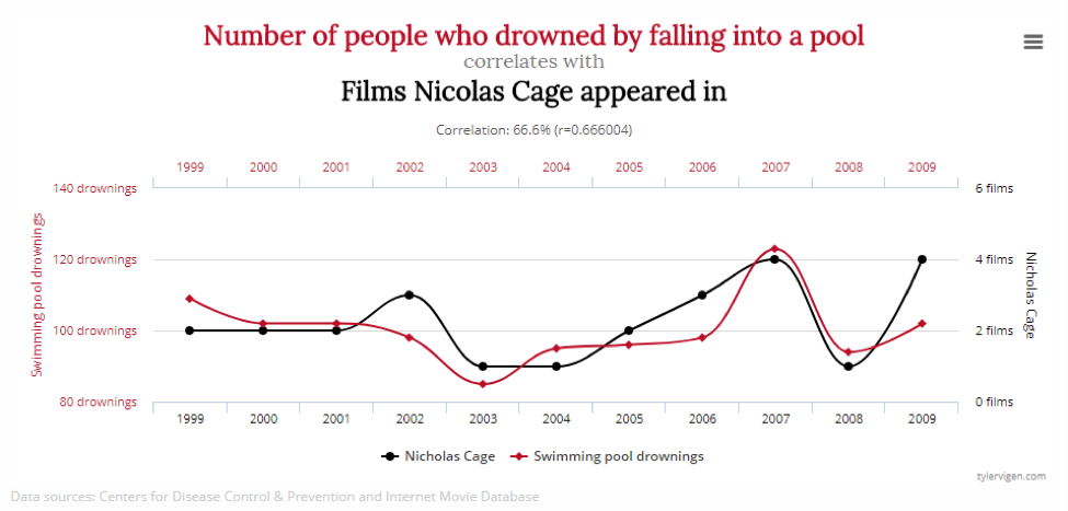
It is also important to understand that correlation and causation are not the same thing. For example, this graph below…

Source: tylervigen.com

Probability

Probability gives us an understanding of risk and reward. From the lottery, premium bond investments and in court cases. 

When something is unlikely, a 30% increase is still a small probability. (1% chance goes to 1.3%). 

When playing board games and rolling two dice, did you know that the most common number to occur would be a 7. Does it feel like it? That’s because you need to roll it many times for this to happen?

Here are some bizarre statistics I found online – I had a good laugh at some of these!

As you can see Statistics is a really important topic which we are all aware of. Throughout April, I’ll be looking in more detail at all of the maths that we have used during the pandemic.

0

Leave a Reply

X

0

0